Tag Archive for: Graphic design

The impact of colour on brochure design and printing

As a graphic designer, I cannot stress enough the importance of colour in brochure design and printing. Colours can evoke emotions, convey a message, and ultimately influence the success of your brochure. In this blog post, I’ll discuss the impact of colour on brochure design and printing and how to use it to your advantage.

Understanding colour psychology

The psychology of colour is the study of how colours affect human behaviour and emotions. Different colours have different meanings and can evoke specific emotions. For instance, blue is associated with calmness, trustworthiness, and professionalism, while red is associated with passion, excitement, and urgency. Green is often used to represent nature, growth, and freshness, while yellow is associated with optimism, happiness, and creativity.

When designing your brochure, it’s essential to consider the emotions and message you want to convey and choose colours that align with them. By using the right colours, you can influence how your target audience perceives your brand and message.

Printing considerations

When designing your brochure, you need to keep in mind the printing process and how colours will appear on paper. Printed colours often look different from what you see on your computer screen, and the type of paper you choose can also affect colour reproduction. Therefore, it’s crucial to work with a professional printer who can guide you on the best paper and printing techniques to achieve the desired colour results.

colour proofing

Colour combinations

Choosing the right colour combinations is critical in brochure design. The right combination can create a harmonious and attractive design that grabs attention and delivers your message effectively. There are various colour combinations to choose from, including complementary, analogous, and monochromatic.

Complementary colours are opposite on the colour wheel and create a vibrant contrast. Analogous colours are adjacent on the colour wheel and create a harmonious and cohesive design. Monochromatic colours are different shades of the same colour and create a clean and sophisticated look.colour theory diagram, showing the 7 types of colour styles

Colour consistency

Consistency is key when it comes to colour in brochure design. You want your brand colours to be consistent across all marketing materials to create a cohesive and recognisable brand identity. This includes using the same shades of colour, colour combinations, and placement throughout your brochure.

colour consistency off the press

Final thoughts

In summary, colour is a critical aspect of brochure design and printing. To create a compelling brochure, it’s important to consider colour psychology, printing techniques, colour combinations, and consistency. By implementing these strategies, you can effectively use colour to communicate your brand message and resonate with your target audience.

Moving forward, I recommend exploring different colour combinations and experimenting with various shades to create a unique and memorable brochure design. It’s also important to regularly review your branding materials to ensure consistency and make necessary updates as your brand evolves. By continuously improving your brochure design and utilising the power of colour, you can enhance the impact of your marketing efforts and achieve your desired results.

The impact of digital print marketing for charities

The advent of digital technology has revolutionised the way charities communicate and market themselves to their supporters. With the recent pandemic and imposed social distancing restrictions, charities have been quick to adopt digital tools such as Zoom and digital fundraising platforms to reach their supporters more efficiently and quickly. These digital marketing tools provide organisations with valuable insights into their audience through digital reports that track metrics such as page views and time spent on each page.

Digital technology has significantly impacted the way charities reach and engage with their supporters, but print marketing is still a valuable tool in their marketing mix. While digital marketing offers speed, efficiency and targeted reach, print marketing provides a tangible and lasting connection that can be leveraged to build relationships and drive fundraising success. Here, we’ll explore the impact of digital technology on print marketing for charities, and the ways in which print can still play a vital role in the charity sector.

Reaching a wider audience with print marketing One of the key advantages of print marketing for charities is that it reaches a broader audience. Digital marketing is often targeted to specific demographics based on data such as age, income, and location, while print materials can reach a wider range of people, regardless of their technical skills or access to the internet. This is especially important for charities, who often have a diverse range of supporters and stakeholders, as it allows them to reach everyone with a single message.

Print marketing is also more difficult to ignore than digital marketing. Many people are bombarded with digital marketing messages every day, and often tune them out or simply delete them. On the other hand, print materials are often kept and displayed, especially if they are visually appealing and well-designed. This means that charities are able to reach their supporters with a message that they are more likely to remember and take action on.

Lower cost and easier measurement with print marketing can also be more cost-effective for charities than digital marketing. While digital marketing can be relatively cheap to execute, it can be expensive to measure the results, and it can be difficult to determine the return on investment. Print materials, on the other hand, can be produced at a lower cost and are much easier to measure in terms of response rates and conversions. For example, the response rate for direct mail is typically higher than that of email, making it a more cost-effective choice for charities.

Furthermore, print marketing can be easily measured and tracked, giving charities valuable insight into the effectiveness of their campaigns. By analysing response rates, donation amounts, and other key metrics, charities can determine what works and what doesn’t, and make data-driven decisions about their future marketing efforts.

Building relationships with print marketing One of the biggest benefits of print marketing for charities is the emotional connection it creates between the charity and its supporters. The tangible nature of print provides a physical connection that is often more meaningful than a digital message. This emotional connection is key to building lasting relationships with supporters, which is essential for the success of any charity.

For example, a well-designed and well-printed annual report can have a much greater impact than a digital version, as it allows supporters to see and feel the impact of the charity’s work in a tangible way. Similarly, a beautifully designed fundraising appeal is more likely to engage and motivate supporters to take action than an email or social media message.

Fundraising success with print marketing Finally, print marketing has the potential to make a greater impact than digital marketing, especially when it comes to fundraising. Charities that use print materials for fundraising often report that they receive a higher response rate and a higher average gift size than those that rely solely on digital marketing. This is because people are often more willing to give to a cause that they feel a connection with, and print materials are more likely to create that connection.

For example, a beautifully designed and well-printed donation envelope with a personalised message and a reply card can be much more effective than a digital fundraising appeal. Similarly, a well-designed and well-printed annual report can showcase the impact of the charity’s work in a way that inspires supporters to give. Print marketing can also help build trust and credibility for a charity. A well-designed and well-printed annual report, for example, can demonstrate transparency and accountability, which can help build trust with supporters and other stakeholders. Similarly, a well-designed and well-printed fundraising appeal can show that a charity is serious about its mission and is committed to making a real impact.

Print marketing also offers an opportunity for charities to showcase their creativity and personality, which can be particularly important in a crowded and competitive nonprofit landscape. For example, a unique and eye-catching fundraising appeal can help a charity stand out from the crowd and make a lasting impression on its supporters. Similarly, a well-designed and well-printed newsletter can help a charity build relationships with its supporters by showcasing its work and mission in a way that is both informative and engaging.

In conclusion, digital technology has certainly impacted print marketing for charities, but it is far from being replaced. Print still has many benefits for charities and can play a vital role in their marketing mix. From reaching a wider audience to building relationships and inspiring fundraising success, print marketing offers a tangible and lasting connection that digital marketing simply can’t match. By embracing new print techniques and incorporating print into their marketing strategies, charities can ensure that they are reaching their supporters in the most effective and meaningful way possible.

Digital technology has had a significant impact on print marketing for charities in the last 10 years. Charities have been quick to adjust to digital tools, such as Zoom and digital fundraising platforms, due to the pandemic and imposed social distancing restrictions. Digital marketing tools can get messages to supporters faster and more efficiently than print materials, while digital reports can give organisations specific information such as page views and time spent on each page

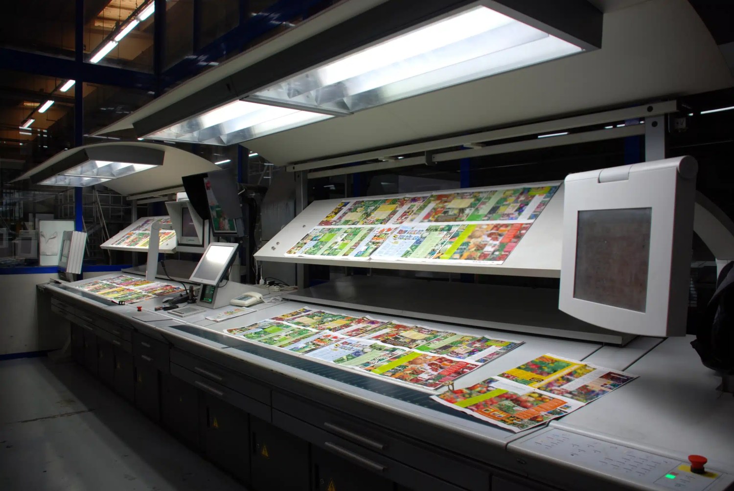
However, printing still has many benefits for charities and businesses. Techniques such as 3D printing and LED UV litho printing are the way forward, with shorter turnaround times and perfect quality compared to older technology. Charities are also able to expand their range of stocks with LED UV litho printing. Additionally, print materials such as press releases, fundraising appeals, newsletters, and recruitment collateral still have a place in nonprofit communications.

The ultimate guide to designing for print

Designing for print can be a challenging task, but with the right knowledge and planning, you can create high-quality designs that will look great when printed. Whether you’re a seasoned pro or just starting out, it’s important to understand the various factors that can affect your final product, such as colour mode, image resolution, and font formatting. In this post, we’ll give you some tips and guidelines to help you create professional and visually appealing designs that meet industry standards. By following these guidelines, you can ensure that your designs will be printed accurately and look the way you intended.

When producing your design, it’s important to set your colours to CMYK (cyan, magenta, yellow, and black) colours unless specified otherwise. This is because most printing processes use these colours to create a full spectrum of colours. If you use RGB (red, green, blue) colours, they may appear differently when printed and can result in a less accurate representation of your design. Make sure to save your design in CMYK format before sending it to the printer.

Using high-resolution images with a resolution of 300 dpi (Dots per inch) or greater is also crucial. This will ensure that your images look sharp and clear when printed. If you use low-resolution images, they may appear pixelated or blurry when printed. Vector graphics are another great option for printing because they are created using mathematical algorithms and can be resized without losing quality. They will maintain their sharpness and clarity no matter how large or small they are printed. If you use raster graphics, which are made up of pixels, they may become pixelated or blurry when resized.

Make sure to add a margin to keep your main content away from the edge. The margin around the outside of your design is where to avoid including text or logos, this is both good practice for designing and also to keep it well away from being cropped. A good rule of thumb is to give your design a 5mm margin all the way around.

You’ll likely need to add a bleed area as well as the margin, most printers require it. When you stretch your design elements past the edge of the page, a bleed is needed to ensure that you can crop the final design neatly. This is required since the trimming of your materials may vary slightly as a result of the printing process. You may make sure that your design components extend past the final trim area and eliminate any white space around the edges of your printed product by inserting a 3mm bleed.

When you’re ready to send your design, make sure to save it as a PDF (Portable Document Format). PDFs can be saved from most software either directly, through export options or sometimes as a print-and-save setting. Most commercial printers (like us)will use PDFs as they keep the colour, font and quality information in them even if they were produced in software that the print company doesn’t have. This way you will have a consistent result. When saving your design as a PDF, be sure to choose the “Press Quality” or “High-Quality Print” option (if available) to ensure the best possible print quality.

There are many different software options available for designing for print, and the right one for you will depend on your specific needs and skill level. Some well-known software options that are commonly used for designing for print include: Adobe InDesign, Adobe Illustrator, Adobe Photoshop, and Canva. Consider your skill level and the type of project you are working on to determine which software is the best fit for you.

When designing for print, it’s important to make sure that your fonts are properly formatted. This is because not all computers and devices have the same fonts installed, and if your design uses a font that is not installed on the printer’s computer, it could cause issues with the final printed product. To avoid this, you can either outline or embed your fonts. Outlining fonts means converting the text in your design into a series of vector shapes, while embedding fonts means including the font file with your design file. Consider your specific needs and the requirements of your project to determine which approach is best for you.

It’s worth us briefly discussing spot colours and Pantones. Spot colours are specific colours that are created using a single ink rather than a combination of colours. They are often used by big brands to maintain consistency in their branding and are usually identified by a specific code, such as a Pantone colour. Pantone colours are a widely recognized system for identifying spot colours and are used by many printers and design professionals. While spot colours and Pantones can be an important consideration for big brands, they generally require specialist printing equipment and may not be necessary for most projects.

By following the tips above, you can create professional artwork without getting nasty surprises when your print company doesn’t accept the artwork or worse delivers your print and it doesn’t meet your expectations. Use these as a rule of thumb no matter what you are designing, these will work with most UK printers but always make sure to read any artwork specific guidelines. 

How to Get Your Artwork Print-Ready: A Practical Guide

Preparing your artwork for print is crucial to achieving a high-quality final product. By following these steps, you can avoid costly errors and ensure your designs look as polished in print as they do on screen.


1. Set Up Your Document Correctly

  • Size Matters: Ensure your document matches the desired print size. If you’re unsure, consult your designer or check our size guide.
  • Add Bleed (3mm Minimum): Extend your design 3mm beyond the trim lines to avoid unwanted white edges when cutting. This is especially important for full-bleed designs like brochures and posters.

2. Check Your Colour Mode

  • Switch to CMYK: Print processes use CMYK (Cyan, Magenta, Yellow, Black), not RGB. Converting to CMYK ensures colours translate correctly from screen to print.
  • Proof Carefully: Colours on your screen may differ slightly from printed output. Consider requesting a proof if exact colours are critical.

3. Convert Text to Outlines

  • Why It’s Important: Converting text to outlines ensures fonts won’t change or misalign during the printing process.
  • How to Do It: In Adobe Illustrator or InDesign, use the “Create Outlines” option to make your text scalable and uneditable.

4. Include Print Marks and Bleed

  • Trim Marks: These indicate where the printer will cut your document. Always include them in your file.
  • Bleed: This extra space around your design prevents visual elements from being accidentally trimmed too close to the edge.

5. Ensure High Resolution

  • Minimum Resolution: 300dpi (dots per inch) is the industry standard for print. For large-scale designs, aim for 600dpi to preserve detail when scaling down.
  • How to Check: In Photoshop, go to Image > Image Size and confirm the resolution is 300dpi or higher.

6. Save as a PDF

  • Why PDF?: PDFs retain all design elements, ensuring your file is print-ready.
  • Export Settings: Use “High Quality Print” or “Press Quality” settings in your design software. If in doubt, check with your printer for specific requirements.

Bonus Tips

  • Embed Images: Ensure all linked images are embedded within the file to avoid missing assets during print.
  • File Naming: Use clear, descriptive file names to help your printer identify your job easily.

Why Print-Ready Artwork Matters

A properly prepared file ensures your design looks professional and avoids delays or additional costs. Attention to detail at this stage will save you time and hassle later.


Need Help?

If any of this feels overwhelming, don’t worry! We’re here to assist. Whether you need advice on file setup or a quick check of your artwork, just get in touch.

Get your artwork print-ready today and enjoy the satisfaction of seeing your vision brought to life in stunning detail!
Call: 01483 256785  or Email: [email protected]