Article
How colour affects brochure design and printing

Colour helps readers find their way through a brochure. It can draw attention to a heading, separate product ranges or make a familiar brand recognisable. The choices also need to work on the paper you intend to use, not just on a bright screen.
Choose colours for your audience and message
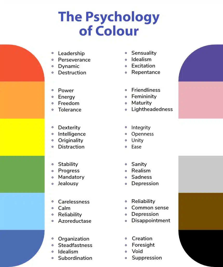
People often associate blue with calmness, red with urgency and green with nature. These are associations, not rules: context, culture and existing brand expectations affect how a colour is read. A red price panel and a red safety warning do different jobs.
Start with your brand palette and decide what each colour does in the brochure. Use a clear contrast for text and avoid relying on colour alone to distinguish information. A label or heading helps readers who cannot easily tell two colours apart.
Check what changes when ink meets paper
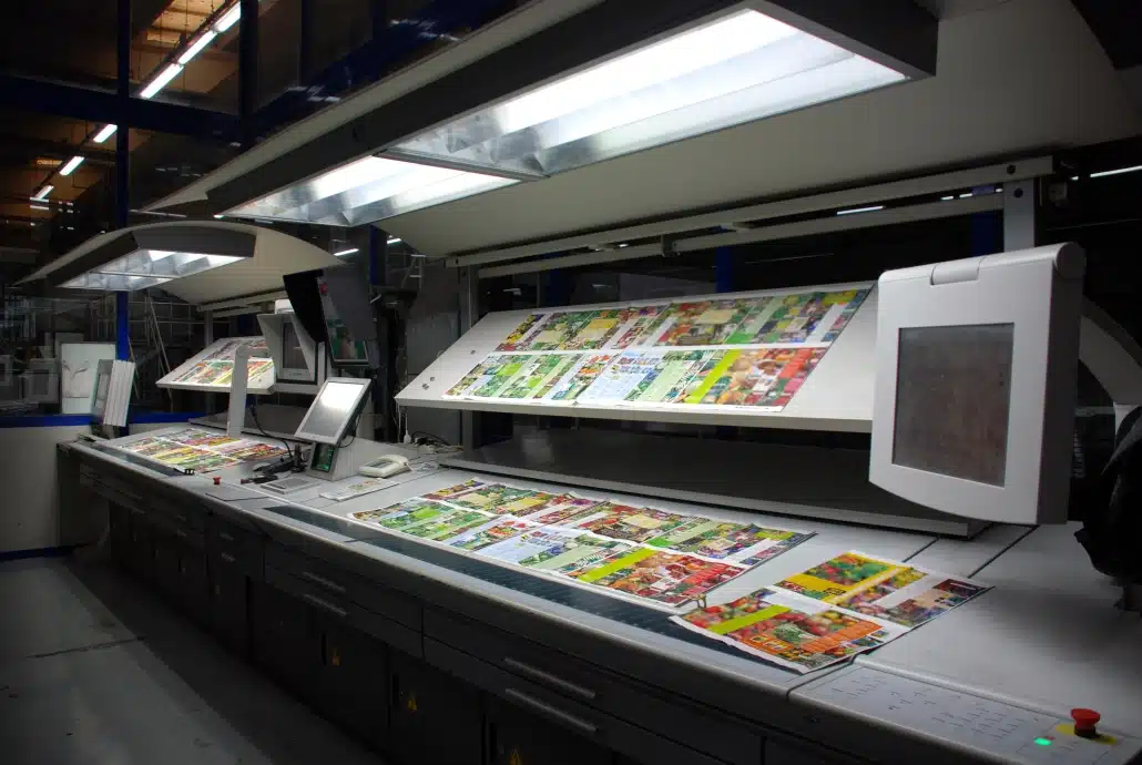
Printed colours can look different from the same design on screen. Screens use RGB light; most full-colour commercial printing uses CMYK inks. Very bright screen colours may not be reproducible in that process, and paper and finishing change their appearance further.
Uncoated paper, silk stock and a laminated cover will not necessarily give an identical result. If the brochure must sit beside an earlier print run or match a particular brand colour, tell us before approval. Agreeing a suitable sample or proof is more useful than expecting a screen preview to guarantee the colour.
Keep colour combinations useful
Complementary colours sit opposite each other on the colour wheel and can make a strong contrast. Analogous colours sit next to each other and can give a quieter feel. A monochromatic palette uses variations of one colour. None is automatically the right choice for a brochure.
Try the palette on a real page containing body text, a heading, a photograph and a contact detail. If everything competes for attention, reduce the number of accent colours. Check small text and pale tints in particular; an attractive swatch is not enough if the page is hard to read.

Keep the brochure consistent
Use the same agreed colour values for repeated elements throughout the file. A heading should not change shade because one page was copied from an older document. Keep photographs consistent too, especially when images of the same product appear on different pages.
Save the approved artwork and note the paper and finish used for the job. This gives a repeat order a clear starting point, although normal differences between materials and print runs can still occur.
Check the file before approving print
Review the exported PDF for unexpected colour changes, unreadable text and inconsistent images. Our CMYK and colour guide explains colour-mode and proofing checks. For multi-page work, also check booklet page order and bleed.
You can compare A5 stapled booklets, premium A5 booklets and the wider brochure range. If colour matching or paper choice needs discussion, send us the brief before placing the order.