Tag Archive for: design elements

Design Elements That Transform Ordinary Flyers into Powerful Tools

Flyers are a staple in the print marketing world, but not all flyers are created equal. The difference between an ordinary flyer and a powerful marketing tool often lies in its design elements. Let’s explore the aspects that can turn your next flyer into an impactful piece.

Why Design Matters in Flyers:

Flyers serve as a quick and efficient way to capture attention and convey a message. While the content is crucial, the design is what initially grabs the audience’s attention and persuades them to read on.

Key Design Elements:

  1. Visual Hierarchy: Organise the elements to guide the reader’s eye from the most crucial part to the least.
  2. Colour Palette: A cohesive colour scheme enhances readability and engagement.
  3. Typography: Choose fonts that align with your brand and are easy to read at a glance.

Product Spotlight: Premium Flyers

If you’re looking for quality and impact, consider our premium flyers. Printed to the highest standards, they can capture attention and convey your message effectively.

Common Design Mistakes to Avoid:

  • Overcrowding: Too much information can make the flyer cluttered and difficult to read.
  • Low-Resolution Images: Poor image quality can make the flyer look unprofessional.
  • Inconsistent Branding: Ensure that your flyer aligns with your brand’s colour scheme, logo, and typography.

Tips for an Effective Flyer:

  • Include a clear call-to-action (CTA).
  • Use high-quality images and graphics.
  • Proofread thoroughly to avoid errors that can undermine credibility.

Final Remarks:

When it comes to flyer design, small details can make a significant impact. By focusing on design elements like visual hierarchy, colour, and typography, you can transform your flyers into powerful tools that not only capture attention but also drive action.


Feel free to insert the product URL where it says “your-product-url-here” to link to your specific premium flyers. I trust this aligns well with your focus on educating the audience. Let me know if you’d like any further adjustments. Best regards!
 

The impact of colour on brochure design and printing

As a graphic designer, I cannot stress enough the importance of colour in brochure design and printing. Colours can evoke emotions, convey a message, and ultimately influence the success of your brochure. In this blog post, I’ll discuss the impact of colour on brochure design and printing and how to use it to your advantage.

Understanding colour psychology

The psychology of colour is the study of how colours affect human behaviour and emotions. Different colours have different meanings and can evoke specific emotions. For instance, blue is associated with calmness, trustworthiness, and professionalism, while red is associated with passion, excitement, and urgency. Green is often used to represent nature, growth, and freshness, while yellow is associated with optimism, happiness, and creativity.

When designing your brochure, it’s essential to consider the emotions and message you want to convey and choose colours that align with them. By using the right colours, you can influence how your target audience perceives your brand and message.

Printing considerations

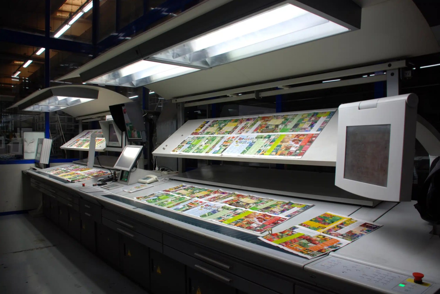
When designing your brochure, you need to keep in mind the printing process and how colours will appear on paper. Printed colours often look different from what you see on your computer screen, and the type of paper you choose can also affect colour reproduction. Therefore, it’s crucial to work with a professional printer who can guide you on the best paper and printing techniques to achieve the desired colour results.

colour proofing

Colour combinations

Choosing the right colour combinations is critical in brochure design. The right combination can create a harmonious and attractive design that grabs attention and delivers your message effectively. There are various colour combinations to choose from, including complementary, analogous, and monochromatic.

Complementary colours are opposite on the colour wheel and create a vibrant contrast. Analogous colours are adjacent on the colour wheel and create a harmonious and cohesive design. Monochromatic colours are different shades of the same colour and create a clean and sophisticated look.colour theory diagram, showing the 7 types of colour styles

Colour consistency

Consistency is key when it comes to colour in brochure design. You want your brand colours to be consistent across all marketing materials to create a cohesive and recognisable brand identity. This includes using the same shades of colour, colour combinations, and placement throughout your brochure.

colour consistency off the press

Final thoughts

In summary, colour is a critical aspect of brochure design and printing. To create a compelling brochure, it’s important to consider colour psychology, printing techniques, colour combinations, and consistency. By implementing these strategies, you can effectively use colour to communicate your brand message and resonate with your target audience.

Moving forward, I recommend exploring different colour combinations and experimenting with various shades to create a unique and memorable brochure design. It’s also important to regularly review your branding materials to ensure consistency and make necessary updates as your brand evolves. By continuously improving your brochure design and utilising the power of colour, you can enhance the impact of your marketing efforts and achieve your desired results.